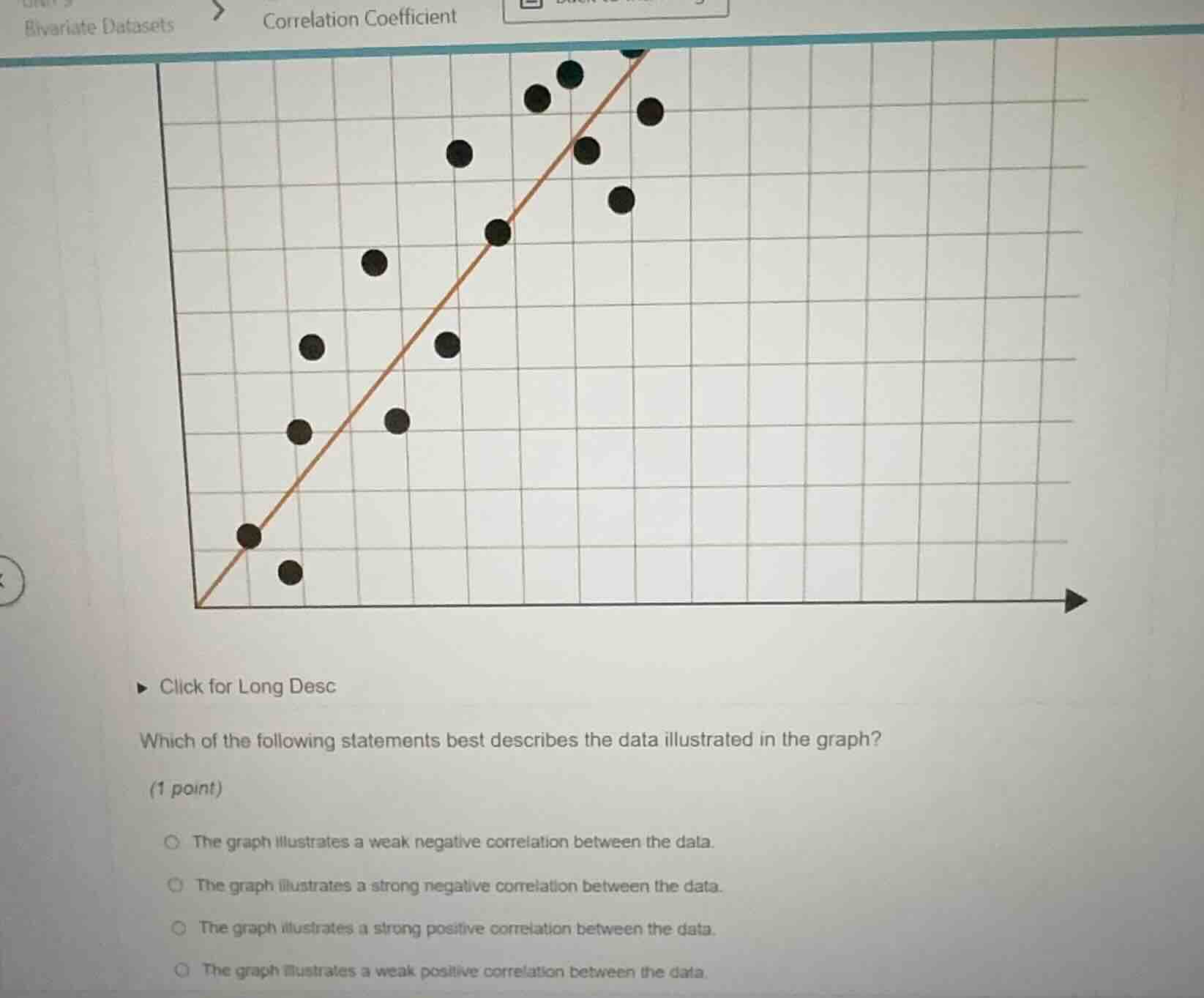
QUESTION IMAGE
Question
click for long desc
which of the following statements best describes the data illustrated in the graph?
(1 point)
the graph illustrates a weak negative correlation between the data.
the graph illustrates a strong negative correlation between the data.
the graph illustrates a strong positive correlation between the data.
the graph illustrates a weak positive correlation between the data.
Brief Explanations
- First, identify the correlation direction: as the x-value increases, the y-value generally increases, so this is a positive correlation.
- Next, assess the strength: the data points are closely clustered around the upward-sloping trend line, indicating a strong correlation.
- Match this to the correct option.

Snap & solve any problem in the app
Get step-by-step solutions on Sovi AI
Photo-based solutions with guided steps
Explore more problems and detailed explanations
C. The graph illustrates a strong positive correlation between the data.