QUESTION IMAGE
Question
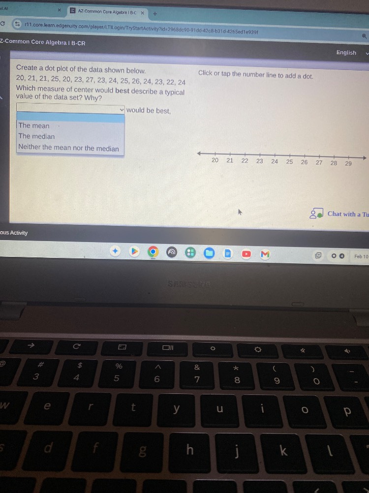
create a dot plot of the data shown below.20, 21, 21, 25, 20, 23, 27, 23, 24, 25, 26, 24, 23, 22, 24which measure of center would best describe a typical value of the data set? why?would be best,the meanthe medianneither the mean nor the medianclick or tap the number line to add a dot.
Step1: Count data frequency
- 20: 3, 21:1, 22:2, 23:2, 24:3, 25:3, 26:1, 27:1
Step2: Check data distribution
Data is symmetric (peaks at middle values, counts balanced around center).
Step3: Compare mean/median suitability
Symmetric data means mean reflects center well.

Snap & solve any problem in the app
Get step-by-step solutions on Sovi AI
Photo-based solutions with guided steps
Explore more problems and detailed explanations
The mean would be best, because the data set has a symmetric distribution with no extreme outliers, so the mean accurately represents the typical value of the data.
Dot Plot Summary (for reference):
| Value | Number of Dots |
|---|---|
| 21 | 1 |
| 22 | 2 |
| 23 | 2 |
| 24 | 3 |
| 25 | 3 |
| 26 | 1 |
| 27 | 1 |