QUESTION IMAGE
Question
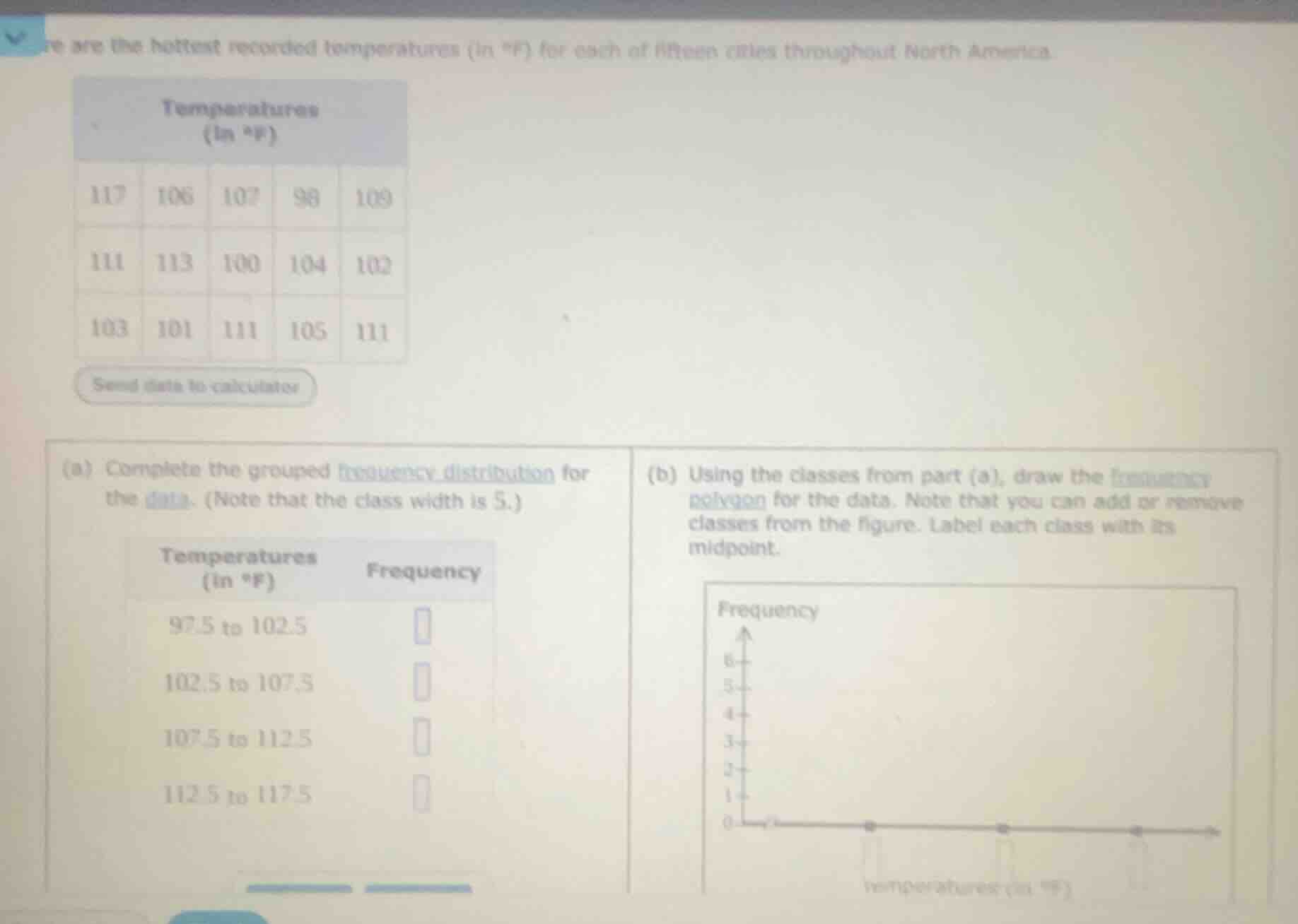
here are the hottest recorded temperatures (in °f) for each of fifteen cities throughout north america.
temperatures
(in °f)
117 106 107 98 109
111 113 100 104 102
103 101 111 105 111
(a) complete the grouped frequency distribution for the data. (note that the class width is 5.)
temperatures (in °f) frequency
97.5 to 102.5
102.5 to 107.5
107.5 to 112.5
112.5 to 117.5
(b) using the classes from part (a), draw the frequency polygon for the data. note that you can add or remove classes from the figure. label each class with its midpoint.
Part (a)
Step1: Analyze 97.5 - 102.5
Check which temps lie in [97.5, 102.5). Data: 98, 100, 102, 101. Count: 4.
Step2: Analyze 102.5 - 107.5
Check temps in [102.5, 107.5). Data: 103, 104, 105, 106, 107. Count: 5.
Step3: Analyze 107.5 - 112.5
Check temps in [107.5, 112.5). Data: 109, 111, 111, 111. Count: 4.
Step4: Analyze 112.5 - 117.5
Check temps in [112.5, 117.5). Data: 113, 117. Count: 2.
Step1: Find Midpoints
- 97.5 - 102.5 midpoint: $\frac{97.5 + 102.5}{2} = 100$
- 102.5 - 107.5 midpoint: $\frac{102.5 + 107.5}{2} = 105$
- 107.5 - 112.5 midpoint: $\frac{107.5 + 112.5}{2} = 110$
- 112.5 - 117.5 midpoint: $\frac{112.5 + 117.5}{2} = 115$
Step2: Plot Points
- (100, 4), (105, 5), (110, 4), (115, 2). Connect these points with straight lines, starting and ending at the x - axis (frequency 0) at midpoints 95 (left of 100) and 120 (right of 115).

Snap & solve any problem in the app
Get step-by-step solutions on Sovi AI
Photo-based solutions with guided steps
Explore more problems and detailed explanations
| Temperatures (in °F) | Frequency |
|---|---|
| 102.5 to 107.5 | 5 |
| 107.5 to 112.5 | 4 |
| 112.5 to 117.5 | 2 |
Part (b)
(Note: Since drawing a graph here is textual, describe the frequency polygon steps.)