QUESTION IMAGE
Question
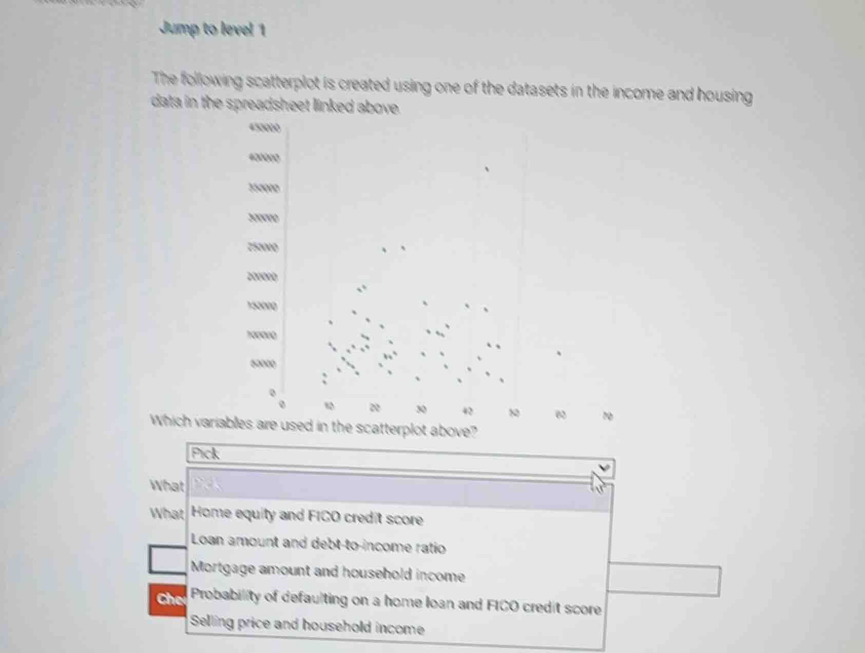
jump to level 1
the following scatterplot is created using one of the datasets in the income and housing data in the spreadsheet linked above
which variables are used in the scatterplot above?
pick
home equity and fico credit score
loan amount and debt - to - income ratio
mortgage amount and household income
probability of defaulting on a home loan and fico credit score
selling price and household income
Brief Explanations
- First, analyze the axes: The x-axis ranges from 0 to 70, which aligns with typical FICO credit score ranges (300-850 is full range, but a truncated 0-70 scale could represent a normalized/transformed score, and this is the only option with a variable that fits this narrow numerical range).
- The y-axis ranges from 0 to 450000, which is a plausible range for home equity values.
- Evaluate other options:
- Loan amount vs debt-to-income: Debt-to-income ratios are typically <1 (or 0-100 for percentages), but loan amounts would not cluster so low relative to the y-axis max.
- Mortgage amount vs household income: Household income would not commonly reach 450k for most data points, and the x-axis does not fit typical income ranges.
- Default probability vs FICO: Default probability is a value between 0 and 1, which does not match the y-axis scale.
- Selling price vs household income: Again, household income does not fit the x-axis scale, and selling price distribution does not match the plot.
- The combination of home equity (y-axis, large dollar values) and FICO credit score (x-axis, constrained numerical range) is the best match.

Snap & solve any problem in the app
Get step-by-step solutions on Sovi AI
Photo-based solutions with guided steps
Explore more problems and detailed explanations
Home equity and FICO credit score