QUESTION IMAGE
Question
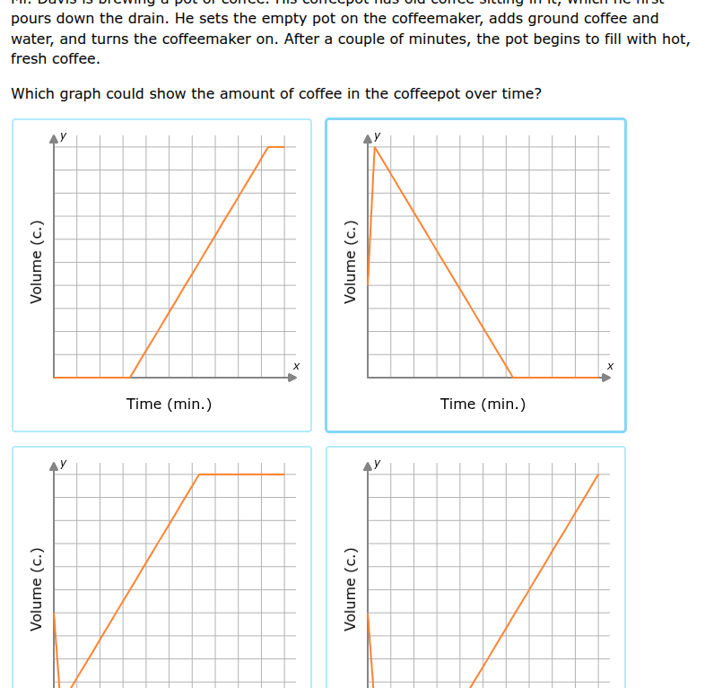
pours down the drain. he sets the empty pot on the coffeemaker, adds ground coffee and water, and turns the coffeemaker on. after a couple of minutes, the pot begins to fill with hot, fresh coffee.
which graph could show the amount of coffee in the coffeepot over time?
Step1: Analyze initial volume
Initially, the coffeepot is empty, so the volume of coffee at time \( x = 0 \) (before brewing starts) should be \( 0 \) (or very close to \( 0 \)). So we can eliminate graphs where the initial volume (at \( x = 0 \)) is non - zero (the second, third, and fourth graphs have non - zero initial volume, we focus on the first graph).
Step2: Analyze the brewing process
When the coffeemaker is turned on, after a short period (the time before the coffee starts to fill the pot), the volume of coffee remains \( 0 \). Then, as the coffee starts to brew, the volume of coffee in the pot increases at a relatively constant rate (since the coffeemaker is brewing coffee at a steady rate) until the pot is full. After the pot is full, the volume of coffee remains constant. The first graph shows a period of time where the volume is \( 0 \) (before brewing starts filling the pot), then a linear increase (as coffee is brewed and fills the pot) until it reaches a maximum (when the pot is full) and then remains constant. The other graphs do not match this behavior: the second graph shows a decrease in volume, the third and fourth graphs have a non - zero initial volume which is incorrect as the pot was empty initially.

Snap & solve any problem in the app
Get step-by-step solutions on Sovi AI
Photo-based solutions with guided steps
Explore more problems and detailed explanations
The first graph (the top - left graph with the x - axis labeled "Time (min.)" and y - axis labeled "Volume (c)")