QUESTION IMAGE
Question
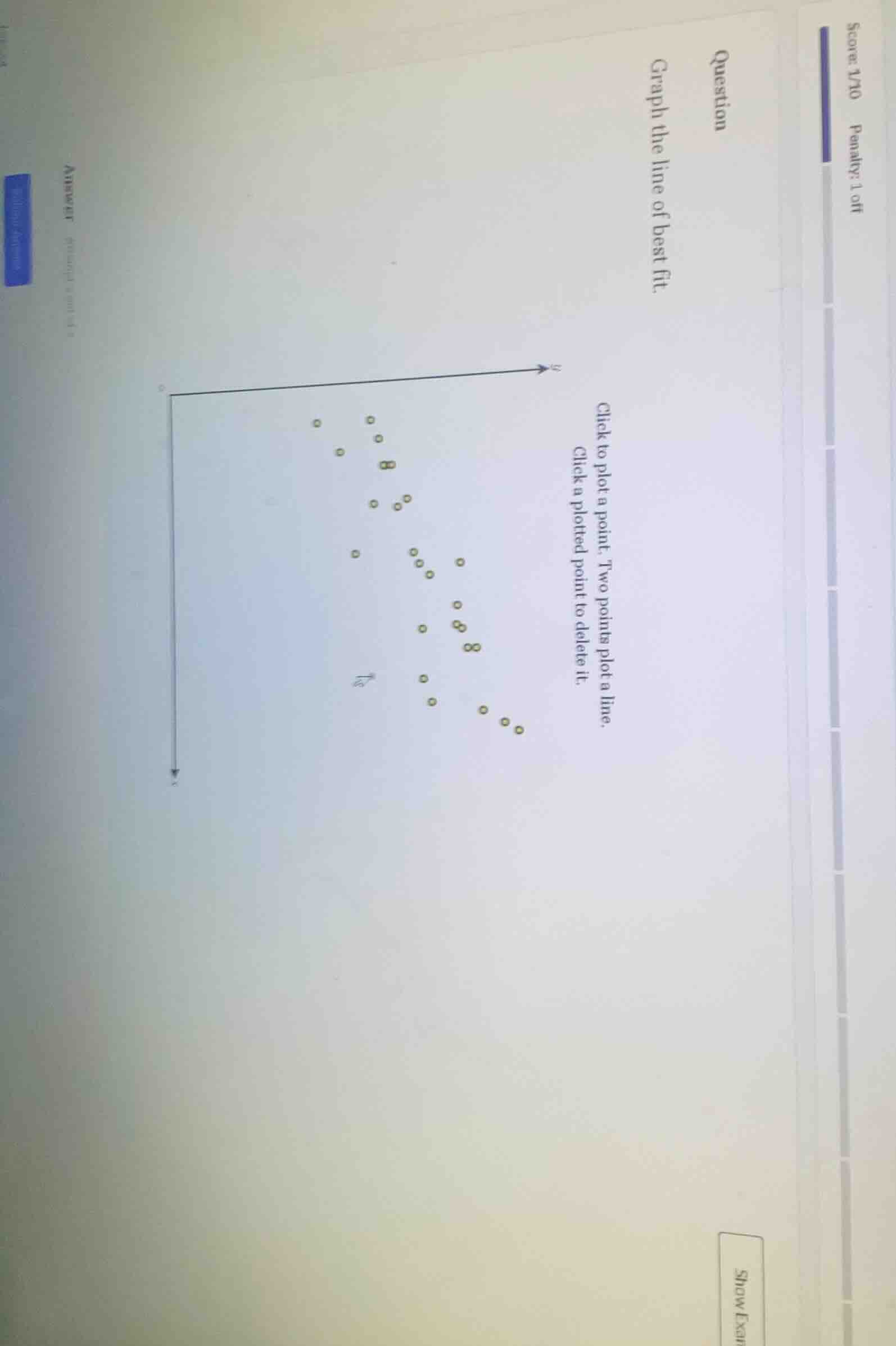
question
graph the line of best fit.
click to plot a point. two points plot a line.
click a plotted point to delete it.
Step1: Identify the trend
The scatter plot shows a negative correlation (as x increases, y decreases). We need to find two points that roughly balance the number of points above and below the line.
Step2: Estimate key points
Looking at the distribution, we can estimate two points. For example, a point in the upper - left cluster and a point in the lower - right cluster. Let's assume we pick a point with a relatively high y - value and low x - value, and a point with a relatively low y - value and high x - value. After estimating, we can plot these two points and draw a line through them. (Since this is a graphical task, the main idea is to find the line that best represents the trend of the data points, minimizing the overall distance from the points to the line.)

Snap & solve any problem in the app
Get step-by-step solutions on Sovi AI
Photo-based solutions with guided steps
Explore more problems and detailed explanations
To graph the line of best fit:
- Observe the general trend of the scatter plot (negative correlation here, as \(x\) increases, \(y\) decreases).
- Identify two points that seem to be representative of the central tendency of the data. For example, pick a point from the upper - left group of points and a point from the lower - right group of points.
- Plot these two points and draw a straight line through them. The line should be positioned such that it is as close as possible to all the data points, with a roughly equal number of points above and below the line. (Note: Since this is a visual/graphical task, the exact points will depend on the visual estimation of the scatter plot's trend.)