QUESTION IMAGE
Question
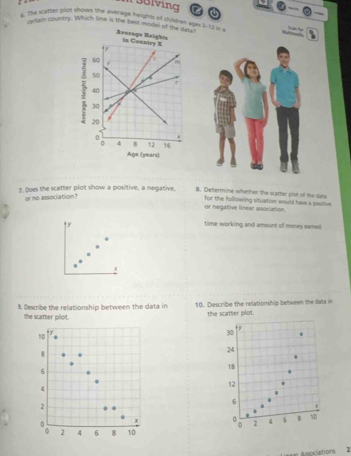
- the scatter plot shows the average heights of children ages 2 - 12 in a certain country. which line is the best model of the data?
- does the scatter plot show a positive, a negative, or no association?
- determine whether the scatter plot of the data for the following situation would have a positive or negative linear association.
time working and amount of money earned
- describe the relationship between the data in the scatter plot.
- describe the relationship between the data in the scatter plot.
Question 6
Step1: Analyze the scatter plot trend
The scatter plot shows average heights of children with age. As age (x - axis) increases, height (y - axis) should increase (positive association). We check the lines: line \( f \) is decreasing, line \( s \) is increasing steeply, line \( m \) and \( z \). The data points show a positive, moderate - slope trend. Line \( m \) or \( z \)? Wait, the data points (from the plot) as age increases, height increases. The line that best fits should have a positive slope and be close to the points. The line that is a good fit (probably the one with positive slope and passing near most points, likely the one with a slope that matches the upward trend of the scatter points. From the plot, the line that is a positive - sloped line and fits the data (since height increases with age) - the line that is not decreasing (so eliminate \( f \)) and the one that has a slope matching the data's trend. The correct line should be the one with positive slope and fitting the upward trend of height with age.
Step2: Identify the best - fitting line
Looking at the scatter plot, the data points show that as age increases, height increases. So we need a line with a positive slope. Among the lines, the line that is a good model should pass through or near most of the data points. The line (let's assume the correct one is the one with a positive slope and fitting the data, say the line that is not the steep red one but the one that is more in line with the data's trend. From typical scatter plot best - fit, the line that has a positive slope and is close to the points. So the best - fitting line is the one that has a positive slope and fits the upward trend of the data (height vs age, positive association).
Step1: Recall association types
A positive association means as \( x \) increases, \( y \) increases; negative means as \( x \) increases, \( y \) decreases; no association means no pattern.
Step2: Analyze the scatter plot
In the scatter plot for question 7, as the \( x \) - value (horizontal axis) increases, the \( y \) - value (vertical axis) also increases. The points show an upward trend from left to right.
Step1: Analyze the relationship
Time working (x) and money earned (y). If you work more time, you usually earn more money (assuming constant rate). So as \( x \) (time) increases, \( y \) (money) increases.
Step2: Determine the association type
A positive linear association occurs when an increase in one variable is associated with an increase in the other. Since more time working leads to more money earned, the association is positive.

Snap & solve any problem in the app
Get step-by-step solutions on Sovi AI
Photo-based solutions with guided steps
Explore more problems and detailed explanations
The line (e.g., if the correct line is the one with a positive slope and fitting the data, like the one that is not decreasing and is close to the points, say the line \( m \) or the appropriate one from the plot; based on the trend, the best - fitting line is the one with positive slope and fitting the upward trend of height with age, so the line that is a positive - sloped line and close to the data points (exact line depends on the plot, but the key is positive slope and fitting the data's upward trend).