QUESTION IMAGE
Question
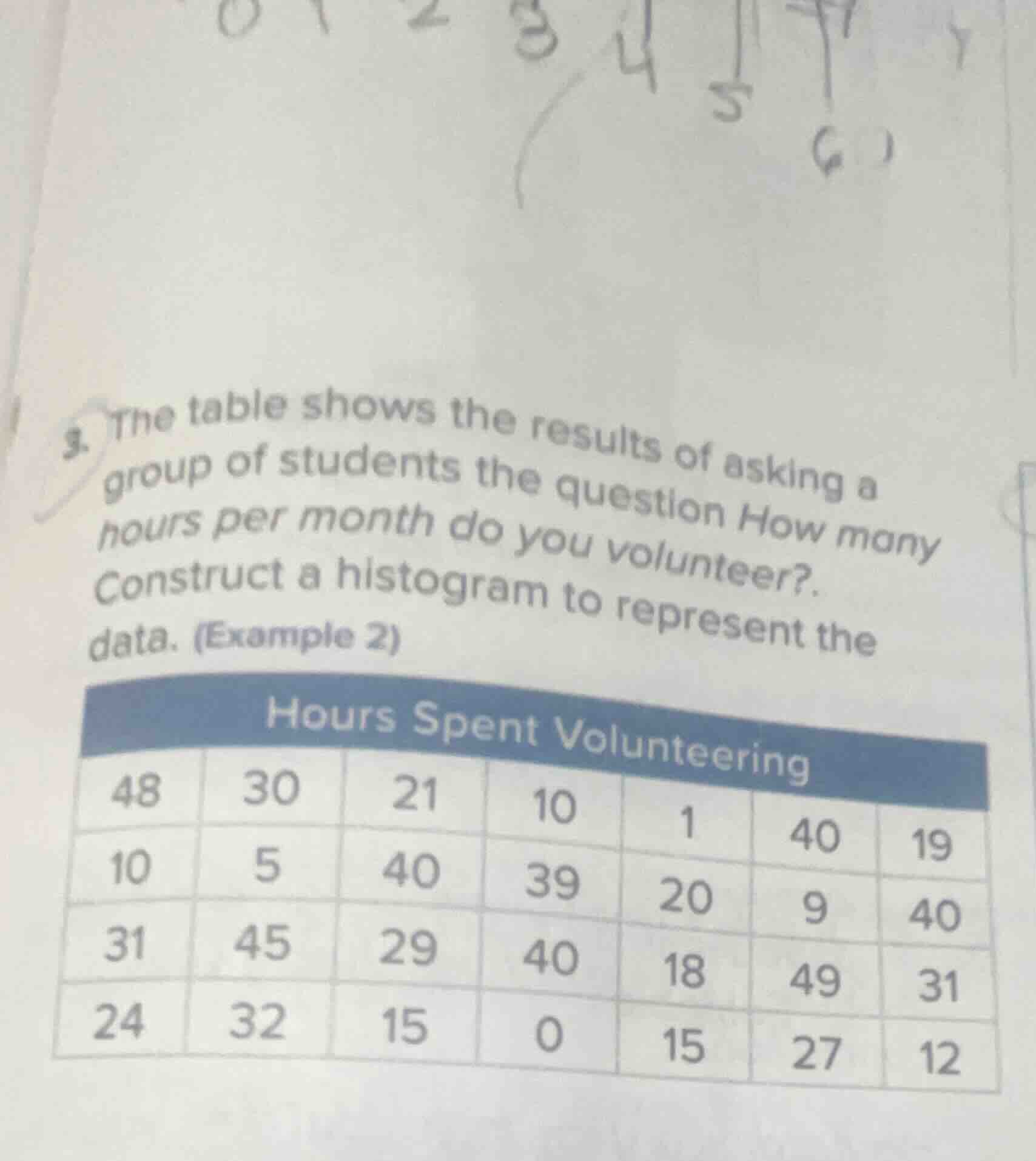
- the table shows the results of asking a group of students the question how many hours per month do you volunteer?. construct a histogram to represent the data. (example 2)
hours spent volunteering
48 30 21 10 1 40 19
10 5 40 39 20 9 40
31 45 29 40 18 49 31
24 32 15 0 15 27 12
Step1: Organize data into intervals
First, identify the range of data: min = 0, max = 49. Use 10-hour intervals: 0-9, 10-19, 20-29, 30-39, 40-49.
Step2: Count frequencies per interval
- 0-9: Values (0,1,5,9) → Frequency = 4
- 10-19: Values (10,10,12,15,15,15,18,19) → Frequency = 8
- 20-29: Values (20,21,24,27,29) → Frequency = 5
- 30-39: Values (30,31,31,32,39) → Frequency = 5
- 40-49: Values (40,40,40,40,45,48,49) → Frequency = 7
Step3: Set up histogram axes
X-axis: Hours Spent Volunteering (intervals 0-9, 10-19, 20-29, 30-39, 40-49)
Y-axis: Frequency (scale 0 to 8)
Step4: Draw bars for each interval
Each bar's height matches its interval's frequency, with no gaps between bars.

Snap & solve any problem in the app
Get step-by-step solutions on Sovi AI
Photo-based solutions with guided steps
Explore more problems and detailed explanations
A histogram with the following specifications:
- X-axis labeled "Hours Spent Volunteering" with intervals: 0-9, 10-19, 20-29, 30-39, 40-49
- Y-axis labeled "Frequency" with scale from 0 to 8
- Bars:
- 0-9: Height = 4
- 10-19: Height = 8
- 20-29: Height = 5
- 30-39: Height = 5
- 40-49: Height = 7
(No gaps between adjacent bars)