QUESTION IMAGE
Question
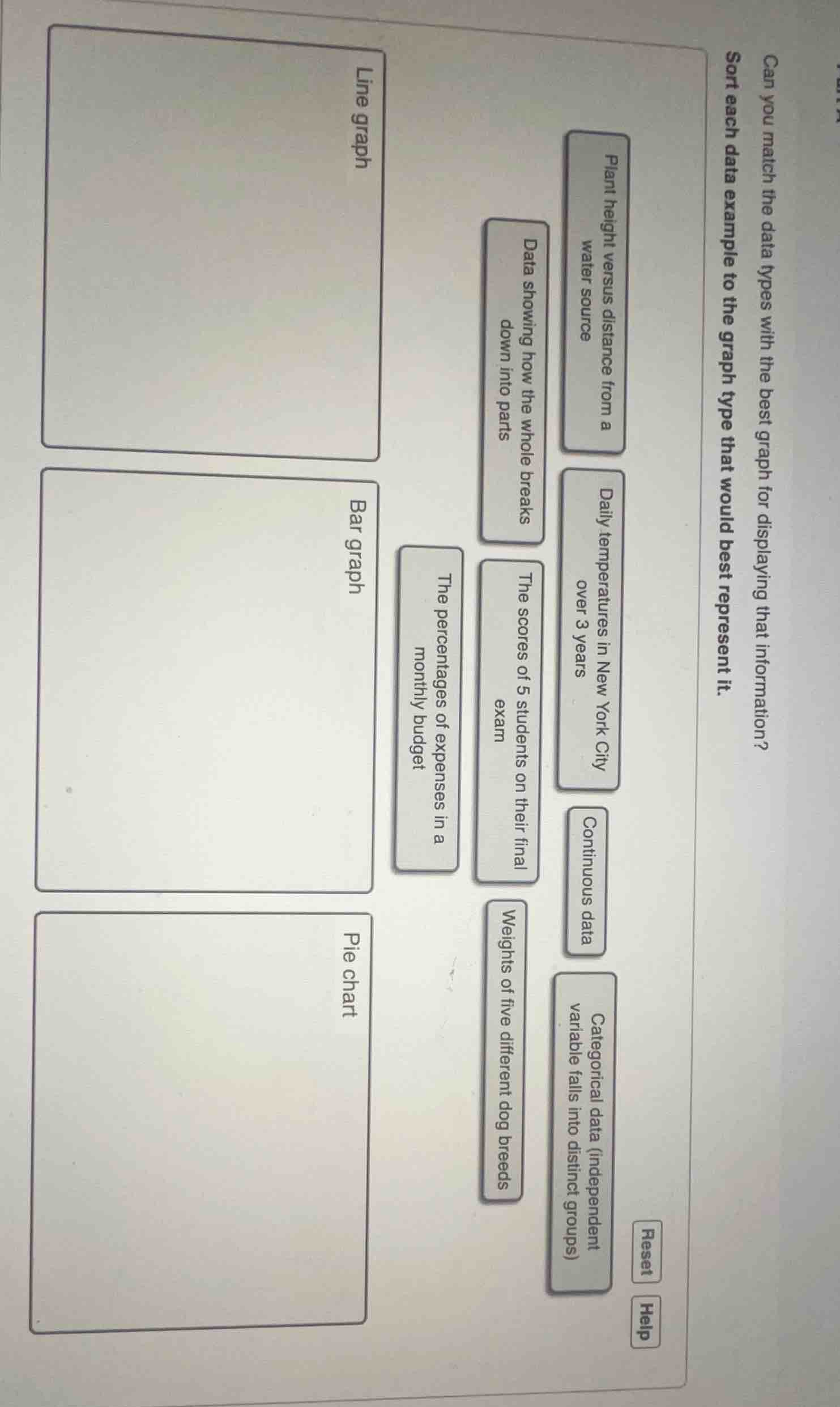
can you match the data types with the best graph for displaying that information? sort each data example to the graph type that would best represent it.
line graph
bar graph
pie chart
plant height versus distance from a water source
daily temperatures in new york city over 3 years
continuous data
categorical data (independent variable falls into distinct groups)
data showing how the whole breaks down into parts
the scores of 5 students on their final exam
weights of five different dog breeds
the percentages of expenses in a monthly budget
reset
help
Response
Line graph:
- Daily temperatures in New York City over 3 years (shows change over time, continuous data)
- Plant height versus distance from a water source (shows relationship, continuous data)
Bar graph:
- The scores of 5 students on their final exam (compares discrete categories)
- Weights of five different dog breeds (compares discrete categories, categorical data)
- Categorical data (independent variable falls into distinct groups)
Pie chart:
- Data showing how the whole breaks down into parts (shows proportions of a whole)
- The percentages of expenses in a monthly budget (shows proportions of a whole)

Snap & solve any problem in the app
Get step-by-step solutions on Sovi AI
Photo-based solutions with guided steps
Explore more problems and detailed explanations
- Line graph: Daily temperatures in New York City over 3 years, Plant height versus distance from a water source, Continuous data
- Bar graph: The scores of 5 students on their final exam, Weights of five different dog breeds, Categorical data (independent variable falls into distinct groups)
- Pie chart: Data showing how the whole breaks down into parts, The percentages of expenses in a monthly budget