QUESTION IMAGE
Question
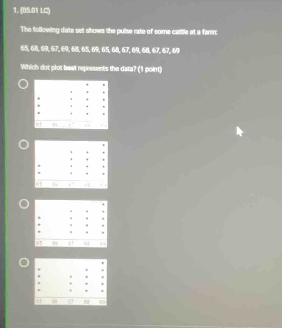
- (05.01 lc)
the following data set shows the pulse rate of some cattle at a farm:
65, 68, 69, 67, 69, 68, 65, 69, 65, 68, 67, 69, 68, 67, 67, 69
which dot plot best represents the data? (1 point)
four dot plot options with radio buttons, image of dot plots omitted
Step1: Count frequency of 65
Count how many times 65 appears:
Data set: 65,68,69,67,69,68,65,69,65,68,67,69,68,67,67,69
Frequency of 65 = 4
Step2: Count frequency of 68
Count how many times 68 appears:
Frequency of 68 = 4
Step3: Count frequency of 67
Count how many times 67 appears:
Frequency of 67 = 4
Step4: Count frequency of 69
Count how many times 69 appears:
Frequency of 69 = 5

Snap & solve any problem in the app
Get step-by-step solutions on Sovi AI
Photo-based solutions with guided steps
Explore more problems and detailed explanations
The correct dot plot is the one with 4 dots above 65, 4 dots above 68, 4 dots above 67, and 5 dots above 69 (the fourth option in the list).