QUESTION IMAGE
Question
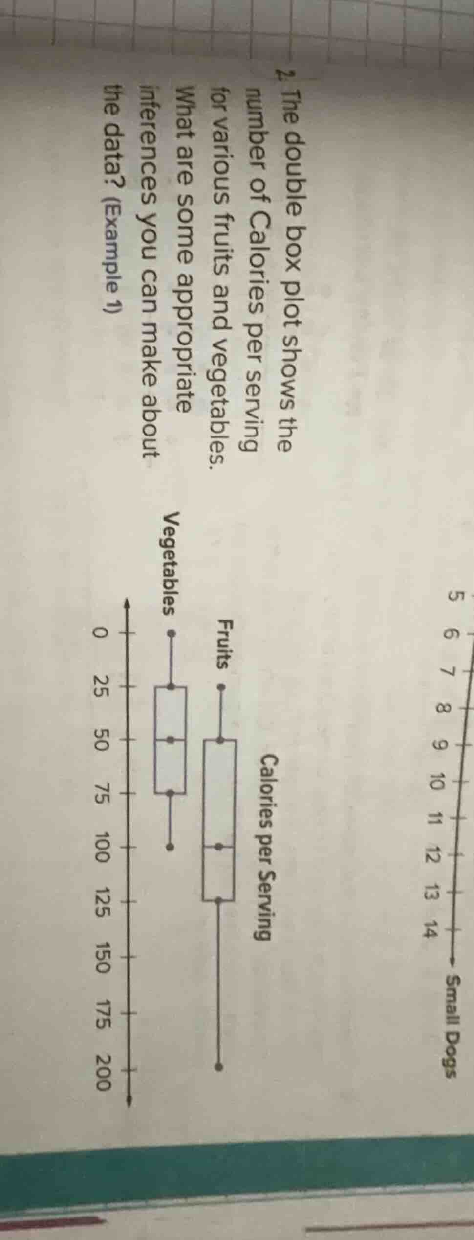
- the double box plot shows the number of calories per serving for various fruits and vegetables. what are some appropriate inferences you can make about the data? (example 1)
Brief Explanations
- Central Tendency: The median calories per serving for fruits (100) is higher than the median for vegetables (50), meaning the typical fruit serving has more calories.
- Spread/Variability: The range of calories for fruits (200 - 25 = 175) is much larger than for vegetables (100 - 0 = 100), so fruit calorie counts are more variable. The interquartile range (IQR) for fruits (125 - 50 = 75) is also larger than the IQR for vegetables (75 - 25 = 50), confirming greater variability in the middle 50% of fruit calorie data.
- Outliers: Neither dataset shows apparent outliers, as all data points fall within the whisker ranges.
- Overall Comparison: Fruits have a higher minimum, maximum, and all quartile values than vegetables, indicating that on average and across the distribution, fruits have more calories per serving than vegetables.

Snap & solve any problem in the app
Get step-by-step solutions on Sovi AI
Photo-based solutions with guided steps
Explore more problems and detailed explanations
- The median calories per serving for fruits is double that of vegetables.
- Calorie counts for fruits have a wider range and greater variability than those for vegetables.
- No outliers are present in either the fruit or vegetable calorie data.
- Fruits consistently have higher calorie values across all parts of their distribution compared to vegetables.