QUESTION IMAGE
Question
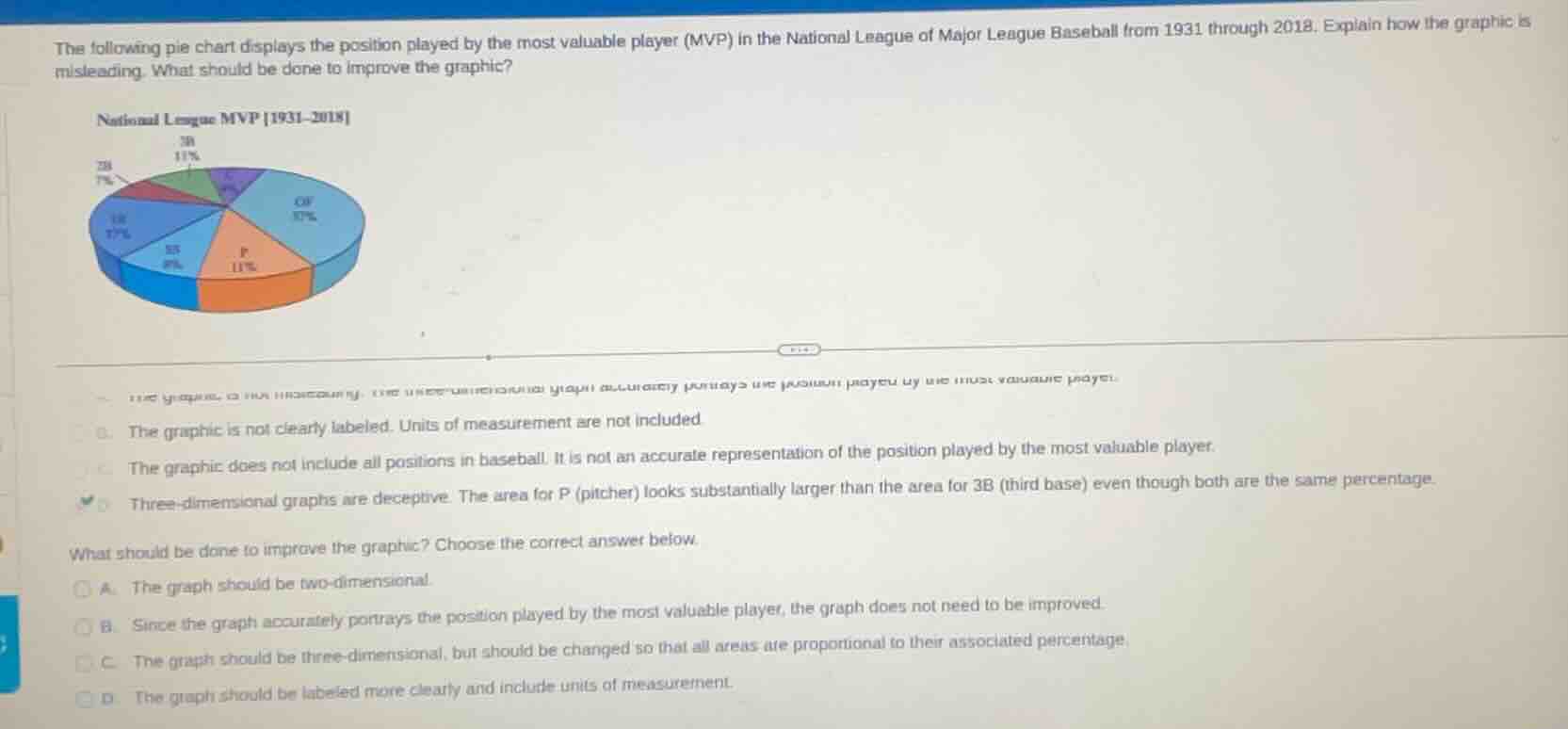
the following pie chart displays the position played by the most valuable player (mvp) in the national league of major league baseball from 1931 through 2018. explain how the graphic is misleading. what should be done to improve the graphic?
national league mvp 1931 - 2018
the graphic is not clearly labeled. units of measurement are not included
the graphic does not include all positions in baseball. it is not an accurate representation of the position played by the most valuable player.
three - dimensional graphs are deceptive. the area for p (pitcher) looks substantially larger than the area for 3b (third base) even though both are the same percentage.
what should be done to improve the graphic? choose the correct answer below.
a. the graph should be two - dimensional.
b. since the graph accurately portrays the position played by the most valuable player, the graph does not need to be improved.
c. the graph should be three - dimensional, but should be changed so that all areas are proportional to their associated percentage.
d. the graph should be labeled more clearly and include units of measurement.
Part 1: Why the graphic is misleading
The pie chart is 3 - D. In 3 - D pie charts, the visual perception of area can be distorted. Here, the "P" (pitcher) segment looks much larger than the "3B" (third base) segment, but their percentages are the same. This misleads the viewer about the relative proportions. The other options are incorrect: option 1 is about labeling/units (not the main issue here), option 2 is about including all positions (the chart is about MVP positions, not all baseball positions), so the correct reason is the 3 - D distortion.
To fix the misleading 3 - D effect, the graph should be made two - dimensional (so that the area of each segment accurately reflects its percentage). Option B is wrong as the graph is misleading. Option C is wrong because keeping it 3 - D and adjusting won't fix the distortion. Option D is about labeling/units, which isn't the main problem here. So option A is correct.

Snap & solve any problem in the app
Get step-by-step solutions on Sovi AI
Photo-based solutions with guided steps
Explore more problems and detailed explanations
Three - dimensional graphs are deceptive. The area for P (pitcher) looks substantially larger than the area for 3B (third base) even though both are the same percentage.