QUESTION IMAGE
Question
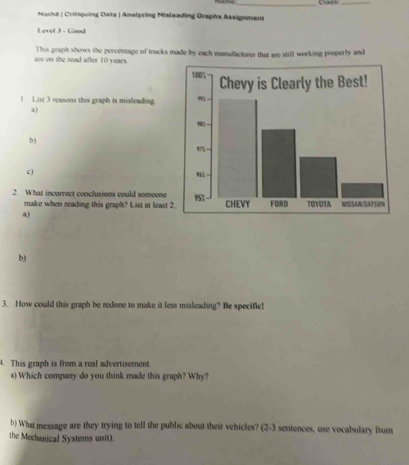
math8 | critiquing data | analyzing misleading graphs assignment
level 3 - good
this graph shows the percentage of trucks made by each manufacturer that are still working properly and are on the road after 10 years.
- list 3 reasons this graph is misleading:
a)
b)
c)
- what incorrect conclusions could someone make when reading this graph? list at least 2.
a)
b)
- how could this graph be redone to make it less misleading? be specific!
- this graph is from a real advertisement.
a) which company do you think made this graph? why?
b) what message are they trying to tell the public about their vehicles? (2 - 3 sentences, use vocabulary from the mechanical systems unit).
graph: title \chevy is clearly the best!\, y - axis (percentage) with labels 95%, 80%, 87%, 92%, 99%, 100% (non - linear spacing), x - axis: chevy, ford, toyota, nissan/datson, bars for each manufacturer
Question 1: List 3 reasons this graph is misleading
a) The vertical axis does not start at 0, exaggerating differences in percentages.
b) The graph has a biased title ("Chevy is Clearly the Best!") that influences interpretation.
c) The y - axis labels are unclear (e.g., "95%", "97%", "99%", "100%"—spacing and labeling may be inconsistent), making it hard to accurately compare values.
a) Someone might think Chevy’s trucks are far more reliable than others, but the actual percentage difference between Chevy and other brands (like Ford) may be small (since the y - axis is misaligned).
b) They could conclude that Nissan/Datsun trucks are extremely unreliable, but the low bar is exaggerated by the non - zero y - axis start.
Start the vertical axis at 0 to show true percentage differences. Label the y - axis clearly with consistent intervals (e.g., 0%, 50%, 100% or smaller, equal intervals). Remove the biased title and use a neutral one (e.g., "Percentage of Trucks Still Working After 10 Years by Manufacturer").

Snap & solve any problem in the app
Get step-by-step solutions on Sovi AI
Photo-based solutions with guided steps
Explore more problems and detailed explanations
a) Vertical axis does not start at 0, exaggerating differences.
b) Biased title influences interpretation.
c) Unclear y - axis labels hinder accurate comparison.