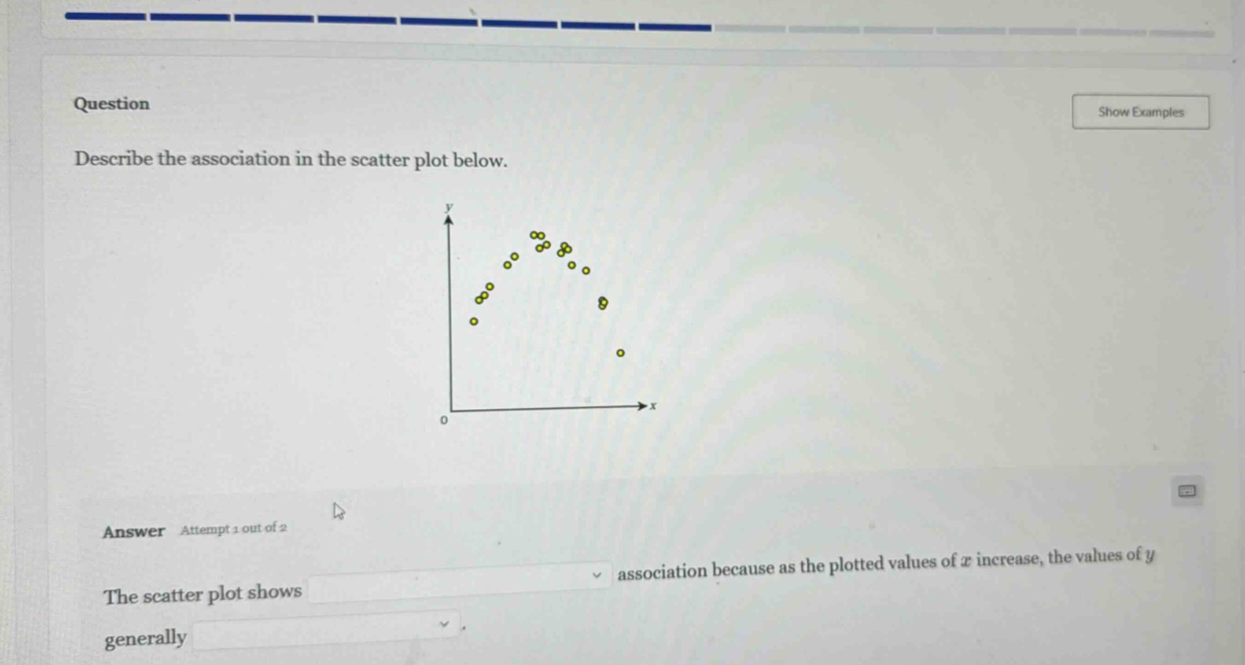
QUESTION IMAGE
Question
question
describe the association in the scatter plot below.
answer attempt 1 out of 2
the scatter plot shows association because as the plotted values of ( x ) increase, the values of ( y ) generally
To describe the association in a scatter plot, we analyze the direction (positive/negative), form (linear/non - linear), and strength (strong/moderate/weak) of the relationship between \(x\) and \(y\). Looking at the given scatter plot, as \(x\) values increase, the \(y\) values first increase and then decrease, so the form is non - linear. The points are somewhat clustered, indicating a moderate association. The direction of the relationship changes, but overall, the pattern is a non - linear (curved) association. The first blank should be filled with "a non - linear (or curved)" and the second blank, considering the trend (increase then decrease, but the overall pattern of change), we can say that as \(x\) increases, \(y\) first increases and then decreases, but for the general trend in terms of the association type, the first part is about the type of association (non - linear) and the second part about the change of \(y\) with \(x\). Wait, re - examining: the first dropdown is for the type of association (like linear, non - linear, positive, negative etc. but here the pattern is curved so non - linear), and the second dropdown is about how \(y\) changes with \(x\). From the plot, as \(x\) increases, \(y\) first rises and then falls, but in terms of the association's direction in the context of the blanks: the first blank: "a non - linear" (or "a curved") association. The second blank: as \(x\) increases, \(y\) first increases and then decreases, but the options (even though not shown, but from the context) - the key is that the association is non - linear (because it's a curve, not a straight line) and the change of \(y\) with \(x\) is that it increases to a point and then decreases. But to fit the blanks: The scatter plot shows a non - linear association because as the plotted values of \(x\) increase, the values of \(y\) generally first increase and then decrease. But maybe the first blank is "a non - linear" and the second blank is "increase then decrease" (or based on typical options, maybe "a non - linear" for the first and "change in a non - linear way" but more precisely, from the plot's shape (a curve), the association is non - linear, and the \(y\) values first go up and then down as \(x\) increases.

Snap & solve any problem in the app
Get step-by-step solutions on Sovi AI
Photo-based solutions with guided steps
Explore more problems and detailed explanations
The scatter plot shows a non - linear association because as the plotted values of \(x\) increase, the values of \(y\) generally first increase and then decrease. (For the blanks: first blank: "a non - linear", second blank: "first increase and then decrease")