QUESTION IMAGE
Question
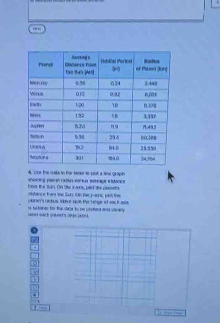
- use the data in the table to plot a line graph showing planet radius versus average distance from the sun. on the x - axis, plot the planets distance from the sun. on the y - axis, plot the planets radius. make sure the range of each axis is suitable for the data to be plotted and clearly label each planets data point.
Brief Explanations
To create the line graph:
- Prepare Axes:
- X - axis: Label "Average Distance from the Sun (AU)". Determine the range: minimum value is 0.39 (Mercury), maximum is 30.1 (Neptune). A suitable range could be 0 to 32 with appropriate intervals (e.g., 0, 5, 10, 15, 20, 25, 30, 35).
- Y - axis: Label "Radius of Planet (km)". Determine the range: minimum value is 0.378 (Earth), maximum is 69,268 (Saturn). A suitable range could be 0 to 70,000 with intervals (e.g., 0, 10,000, 20,000, 30,000, 40,000, 50,000, 60,000, 70,000).
- Plot Data Points:
- Mercury: (0.39, 2440)
- Venus: (0.72, 6031)
- Earth: (1.00, 0.378)
- Mars: (1.52, 3387)
- Jupiter: (5.20, 71492)
- Saturn: (9.58, 69268)
- Uranus: (19.2, 25559)
- Neptune: (30.1, 24764)
- Draw the Line Graph: Connect the plotted points in the order of the planets (or as per the data sequence) to form a line graph. Ensure each data point is clearly labeled with the planet's name.

Snap & solve any problem in the app
Get step-by-step solutions on Sovi AI
Photo-based solutions with guided steps
Explore more problems and detailed explanations
To create the line graph:
- X - axis (Average Distance from the Sun - AU): Range 0 - 32, intervals (e.g., 0, 5, 10, 15, 20, 25, 30, 35).
- Y - axis (Radius of Planet - km): Range 0 - 70,000, intervals (e.g., 0, 10,000, 20,000, 30,000, 40,000, 50,000, 60,000, 70,000).
- Data Points:
- Mercury: (0.39, 2440)
- Venus: (0.72, 6031)
- Earth: (1.00, 0.378)
- Mars: (1.52, 3387)
- Jupiter: (5.20, 71492)
- Saturn: (9.58, 69268)
- Uranus: (19.2, 25559)
- Neptune: (30.1, 24764)
- Graph Drawing: Plot the points and connect them. Label each point with the planet's name.