QUESTION IMAGE
Question
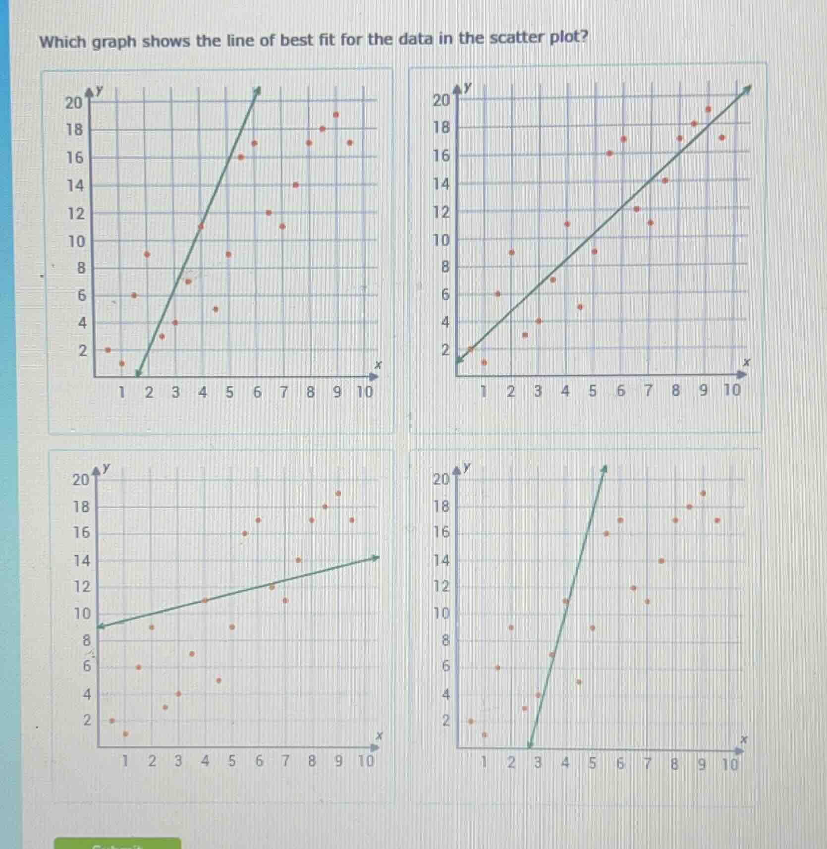
which graph shows the line of best fit for the data in the scatter plot? (four graphs are shown, each with a scatter plot and a line; the graphs are in a 2x2 grid. the x - axis ranges from 1 to 10, and the y - axis ranges from 2 to 20 with grid lines.)
Step1: Recall Line of Best Fit
The line of best fit should represent the general trend of the data points, with roughly equal numbers of points above and below the line, and follow the overall direction of the scatter plot.
Step2: Analyze Each Graph
- Top - Left Graph: The line is too steep and doesn't follow the general trend of most points (many points are far from the line, especially at lower x - values).
- Top - Right Graph: This line follows the general upward trend of the data points. It has a reasonable slope, and the points are relatively evenly distributed around the line, capturing the overall direction of the scatter plot.
- Bottom - Left Graph: The line has too shallow a slope and doesn't align with the upward trend of the majority of the points (especially the upper - right points).
- Bottom - Right Graph: The line is not in the correct position (starts at x = 3) and has an inconsistent slope, not representing the general trend of the data.

Snap & solve any problem in the app
Get step-by-step solutions on Sovi AI
Photo-based solutions with guided steps
Explore more problems and detailed explanations
The top - right graph (the second graph in the top row) shows the line of best fit for the data in the scatter plot.