QUESTION IMAGE
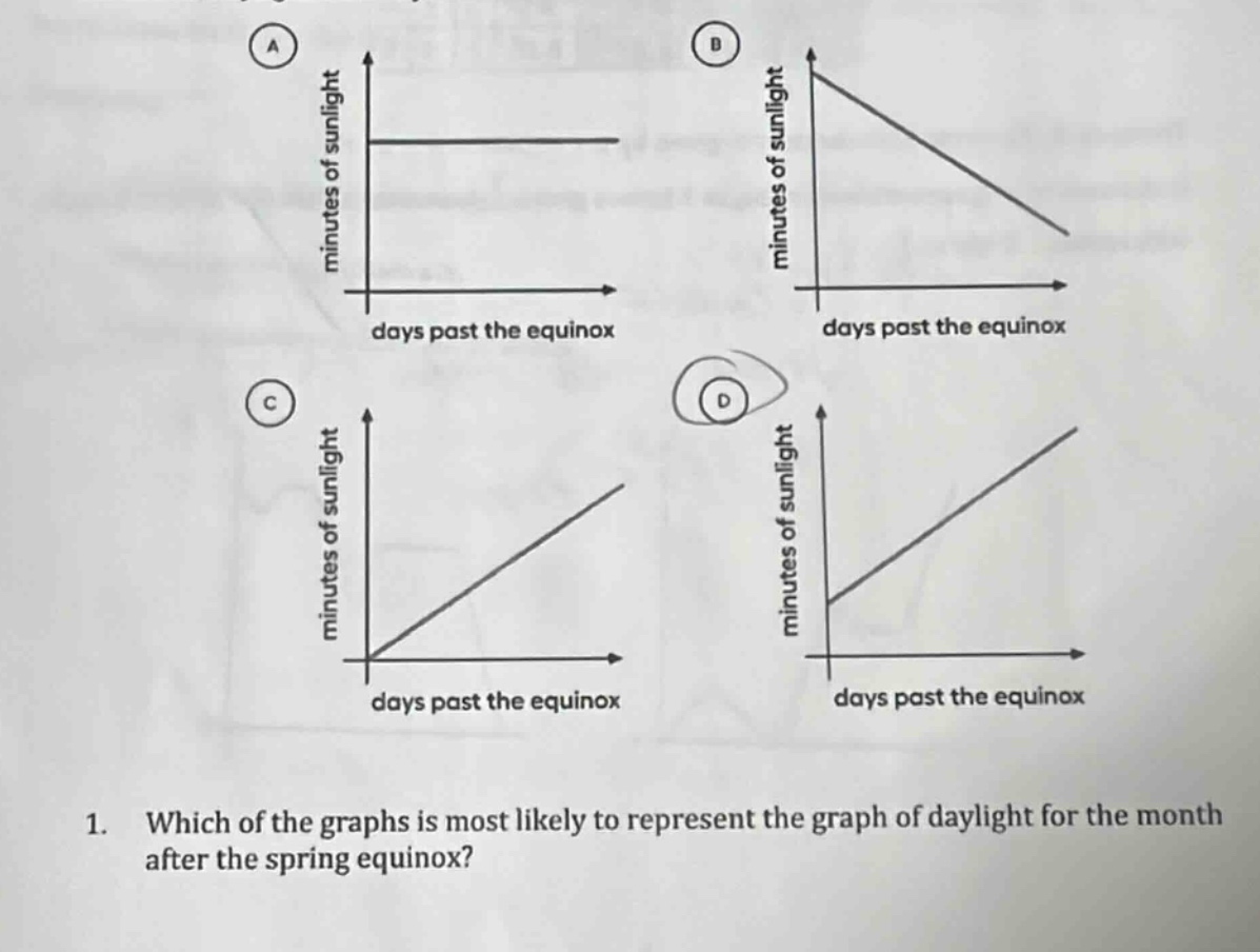
Question
- which of the graphs is most likely to represent the graph of daylight for the month after the spring equinox?
(graphs: a - horizontal line, b - decreasing line, c - line from origin increasing, d - line with positive y-intercept increasing, all with x: days past equinox, y: minutes of sunlight)
Brief Explanations
After the spring equinox, the amount of daylight (minutes of sunlight) increases as days pass. Let's analyze each graph:
- Graph A: Shows a constant amount of sunlight, which doesn't match the increasing daylight after spring equinox.
- Graph B: Shows a decreasing amount of sunlight, which is incorrect as daylight increases after spring equinox.
- Graph C: Starts at (0,0), but at the spring equinox, there is already a certain amount of daylight (not zero).
- Graph D: Shows a linear increase in minutes of sunlight as days past the equinox increase, which matches the real - world phenomenon of increasing daylight after the spring equinox (since we start with a non - zero amount of daylight at the equinox and it increases over time).

Snap & solve any problem in the app
Get step-by-step solutions on Sovi AI
Photo-based solutions with guided steps
Explore more problems and detailed explanations
D. The graph with a linear increase in minutes of sunlight as days past the equinox increase (the graph labeled D)